
caption format} project name / signage designer / architect / notes

Dee and Charles Wyly Theatre / 2x4 / REX I OMA* / This incredibly innovative design for a theatre in Dallas’ new AT&T Performing Arts Center called for an innovative solution to the building signage and wayfinding. The New York design studio 2x4, sensitive to the architect’s unique façade of aluminum extrusions, created the unobtrusive exterior signage by drilling saucer-sized holes through the extrusions to form the text, and it is lit by a 60 foot light tube set inside the extrusion. {*Architecture design by Joshua Prince-Ramus as partner in charge and Rem Koolhaas, in collaboration with Houston-based firm Kendall/Heaton Associates.} Read more on the architecture at Architectural Record and the events at ATTPAC.

Special Thanks to Dan Riley of REX and Martha Kang McGill of Resnicow Schroeder. Photos from Martha and 2x4.
Photo by Iwan Baan.
///

///
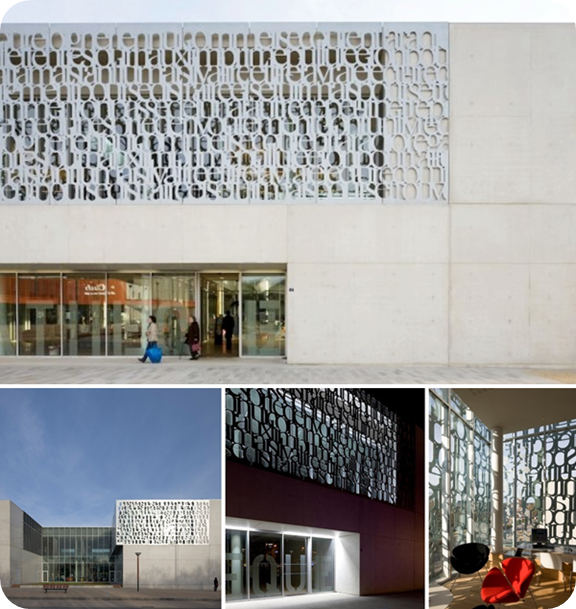
Fougères Biblioteque / Not listed but most likely Tétrarc Architects* / Tétrarc Architects / A relatively simple building form finds its exterior details in the solution for a sunscreen. Creating the sunscreen from meaningful words was fitting to the building’s use as a library. Otherwise it would have been just a missed opportunity. {Tétrarc also designed the interior and furniture.}
Photos by Stephane Chalmeau. Found via archdaily.
///

Photos by Stephane Chalmeau. Found via archdaily.
///
Caltrans District 7 / Follis Design / Morphosis / This was a project I had forgot to include in Part 1 and has always reminded me of a supergraphic, which I loved, in the 2005 film “Fun with Dick and Jane”. {It turns out the film’s sign was made just for the film and is no more.} This grand gesture that marks the building’s location signifies its address as the intersection of 100 Main Street and 100 First Street in downtown LA. The sign also has a remarkable transition from a typical 2-d sign upward to a 3-d form as to be seen from both directions.
Photos from Teague and Generous Adventures respectively.
Photos from Teague and Generous Adventures respectively.
great post!
ReplyDeleteMichael Rock (of 2x4) spoke at UTK CoAD this semester. It's a very well done lecture. Here's the link.
http://160.36.161.128/UTK/Viewer/?peid=2c8b6e878c394ea680b43980c0aab7a5
thanks for sharing. I watched the whole thing and shared link on twitter. I miss going to lectures.
ReplyDelete