

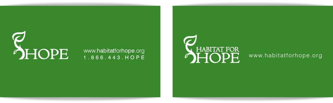
The business card design began with cues from the Habitat for Hope identity and evolved from there. One side of the card contains detailed information and information specific to one person while the other side, wew can also call the back side, tries to emphasize the most important pieces of information. The website appearing on most of the back sides since people are asked to be directed there for the latest information on Habitat for Hope. Below is the exception to the option presentation showing two options for the back side for both the first and second option of the front side.

The option above starts to ground the logo appearing to be either a tuft of grass/ground or a set of doors relating to habitat. This began the thought of placing the information under the HFH branch as if saying "Becky Davis"/ the volunteers of HFH create the firm ground where hope grows.


The last two options above take cues from the latest brochure design where the HFH leaf is enlarged and cropped and the text "Habitat for Hope" on a green blade help fill in the white space between the consistent information {address} and changing information of each person.
I personally like the very last option the best but I also need to be aware which can translate well as letterheads as well.
I like the next to last one best, I think. I don't love the green block with the white text on the last one, but I do like the cropped leaf.
ReplyDeleteI really like the green color with white text..i wish to use it in Metal business cards if possible.
ReplyDelete