


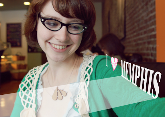
The words "I Love Memphis" and Kerry Crawford, the force behind the I Love Memphis blog, are almost inseparable. Through her blog, many Memphians' express their love of the city by taking a photo with the I Love Memphis sign . In my 3-d graphic experimentation phase, I thought I could do my own graphic interpretation of that sign for Kerry. Experiments are shown above with just some ideas of layout and the heart with the word love. The last image shows a boundary of area where I thought a map of Memphis could be overlayed.
Kerry also requested a look at redesigning the blog header. See below. The images are from her blog from her "Reasons to Love Memphis."

Photo/graphics by Sophorn.
Sophorn - Great shout out to Kerry and the I Heart Memphis blog. I'm a huge fan of both and find her adorable and an excellent representative for my hometown.
ReplyDeleteSince you put it out there, I figured I'd vote. I know you didn't ask, but I have to admit that since I follow both of your online work closely, it might be helpful.
First for the design elements of your 3D graphic. I'd stick with the simple heart. I'm not sure if the color pink is best, but it does girly up the blog and since I'm a daddy of two little girls, I'm a fan of pink - like it or not.
The other looks are creative but don't get the point across as well.
The blog redesign go along well with the simple heart type I voted for above. I'm going to assume it is your favorite as well or you might have included another example. I do want to suggest the images inside the font is not a good match. Maybe consider having a Memphis image in the background with a plain white full text over the top. If you must include an image inside the text, keep it to one image. Changing it for each letter just makes it impossible to read and see any specific image.
Just my two cents from a non-design, but a fan. Thanks for sharing and teaming up with Kerry. Cheers and War Eagle!
Yes good point on the background images although I had just admired a graphic example that made the background image read first and then you slowly figured out the text it made. I went with the background priority first because it was originally a band of photos that was too strong and needed a solution for more white space. So Voila the Memphis text came next.
ReplyDeleteI also told Kerry that the pink was a result of the green sweater. The red looked unpleasing next to the green but pink was great.
thanks so much for your feedback. War Eagle!
Oops didn't log in. This is Sophorn by the way. my comments above.
ReplyDelete